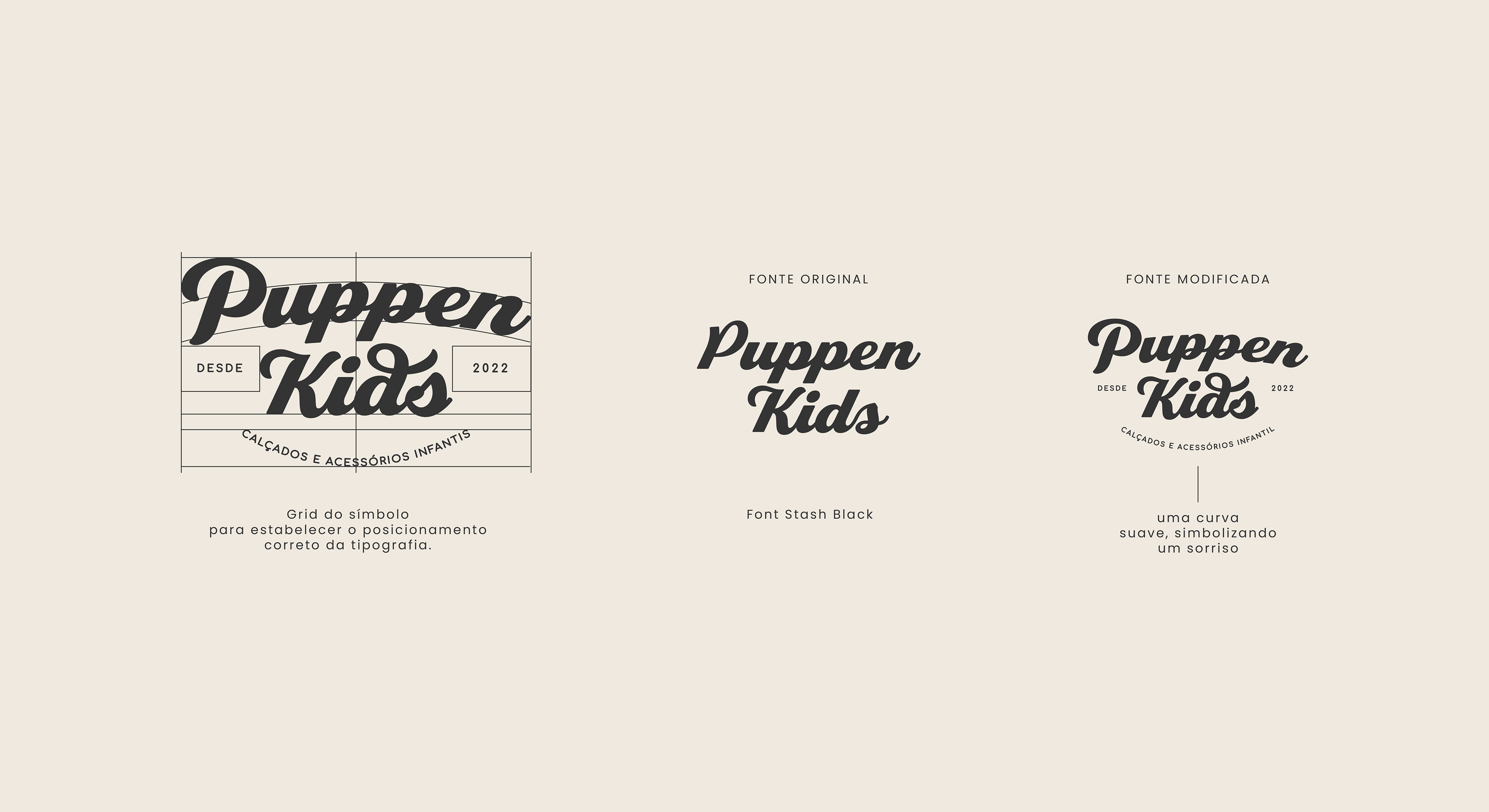
EN | Free your imagination and embark on this journey with us. The word “Puppen” used in the logo comes from the German language, which means dolls. ⠀⠀
⠀
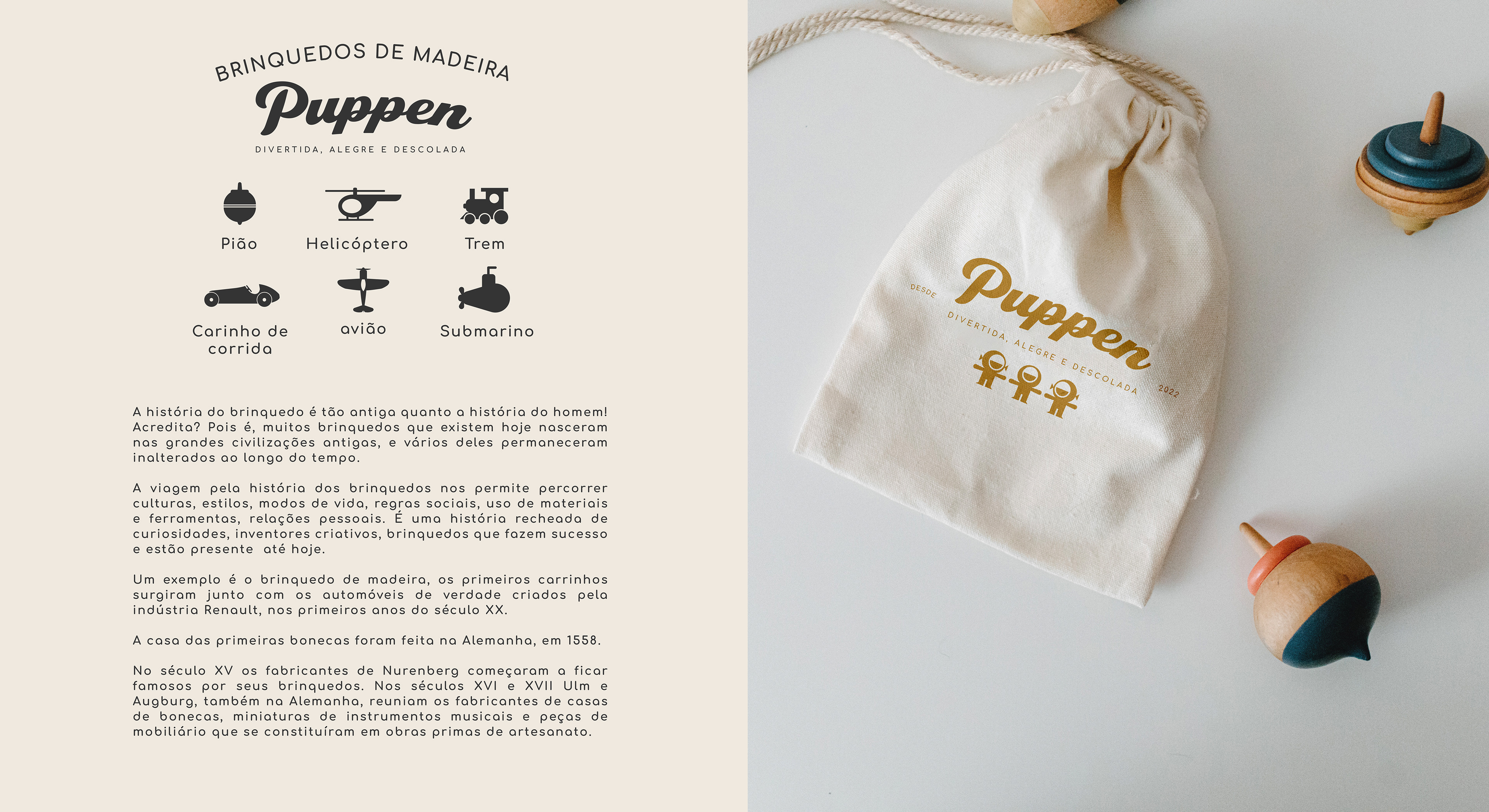
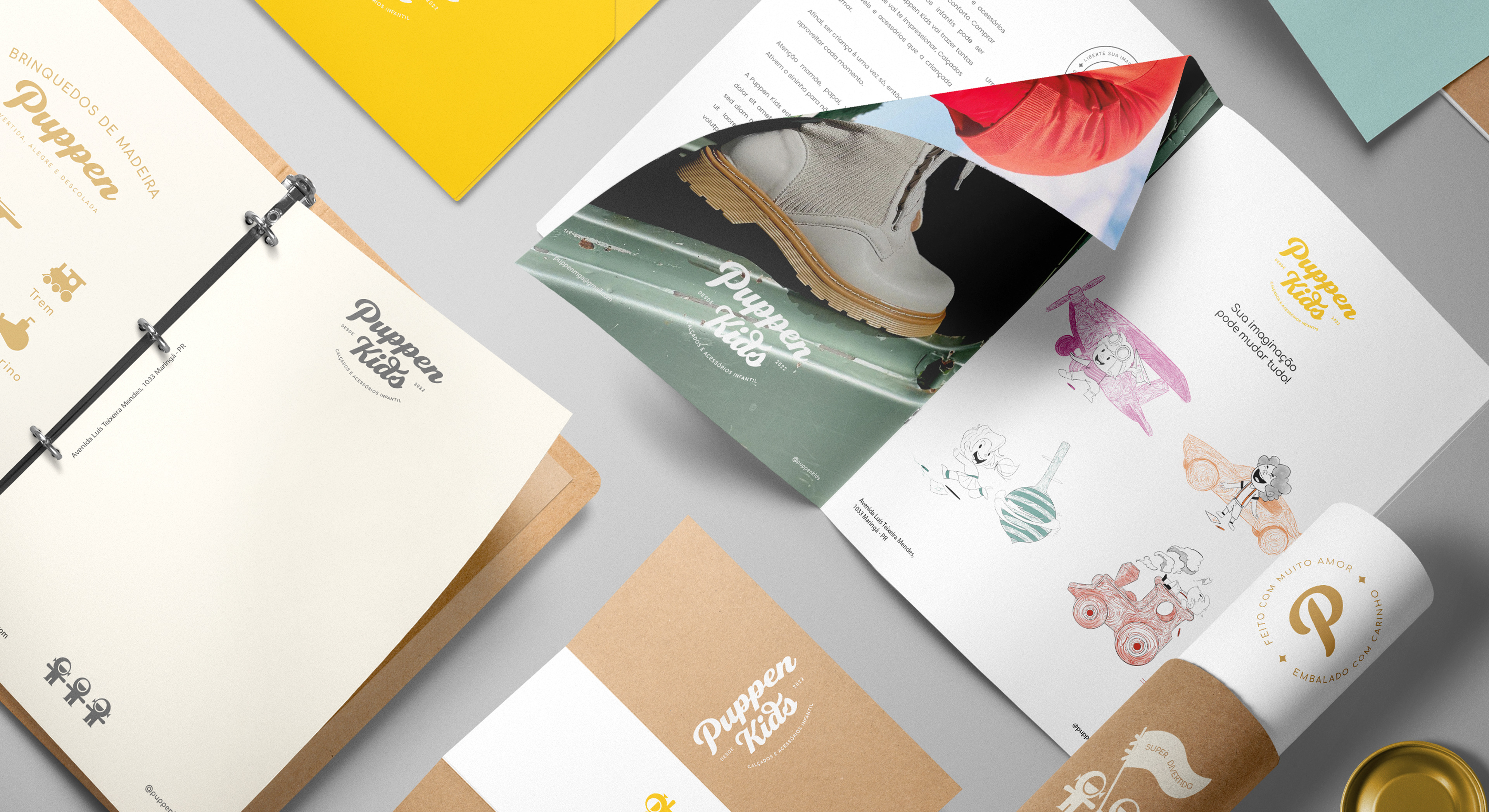
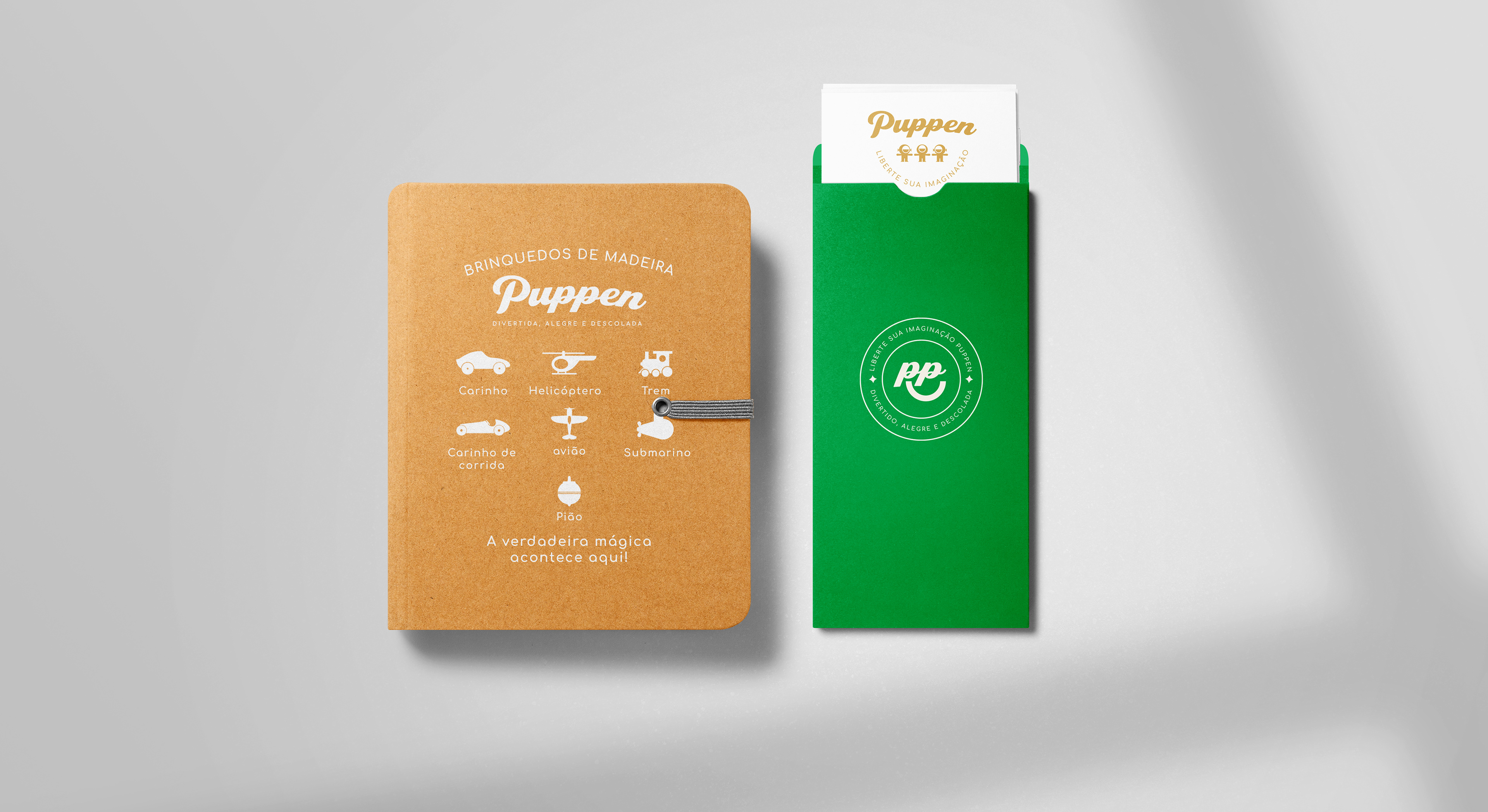
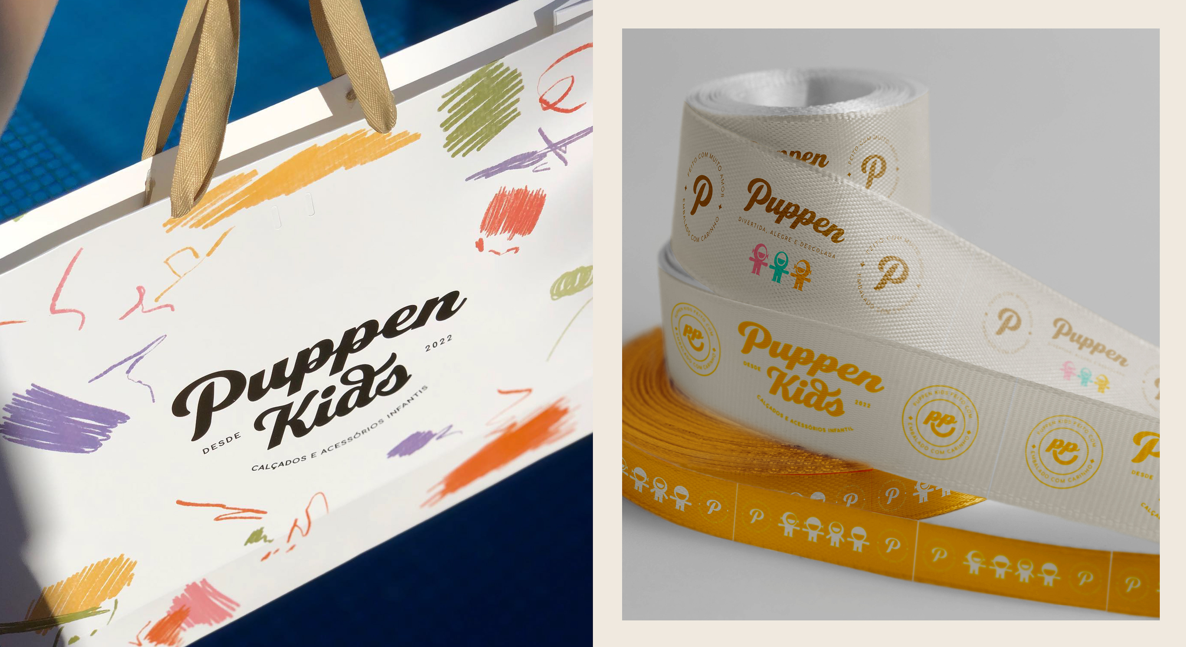
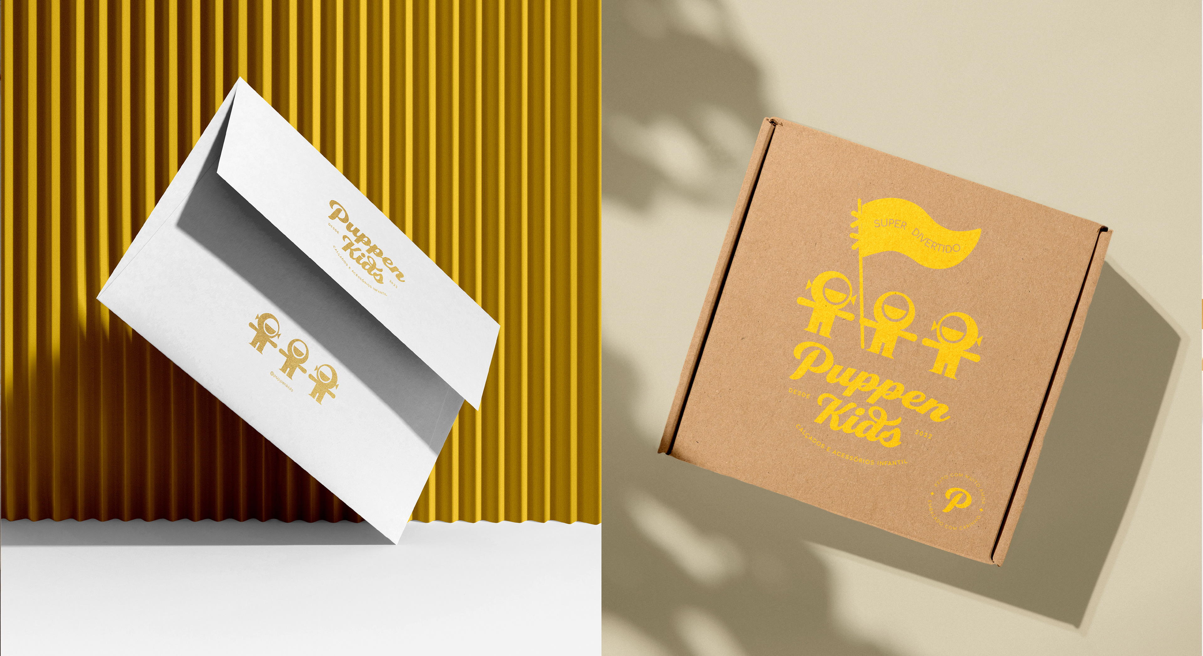
The dolls historically occupy a place that brings warmth and affection, in addition to the rescue of free play. They were used in the complementary material as well as in the company's name, contextualizing the idea of how dressing can be fun, cheerful and cool. ⠀⠀
⠀
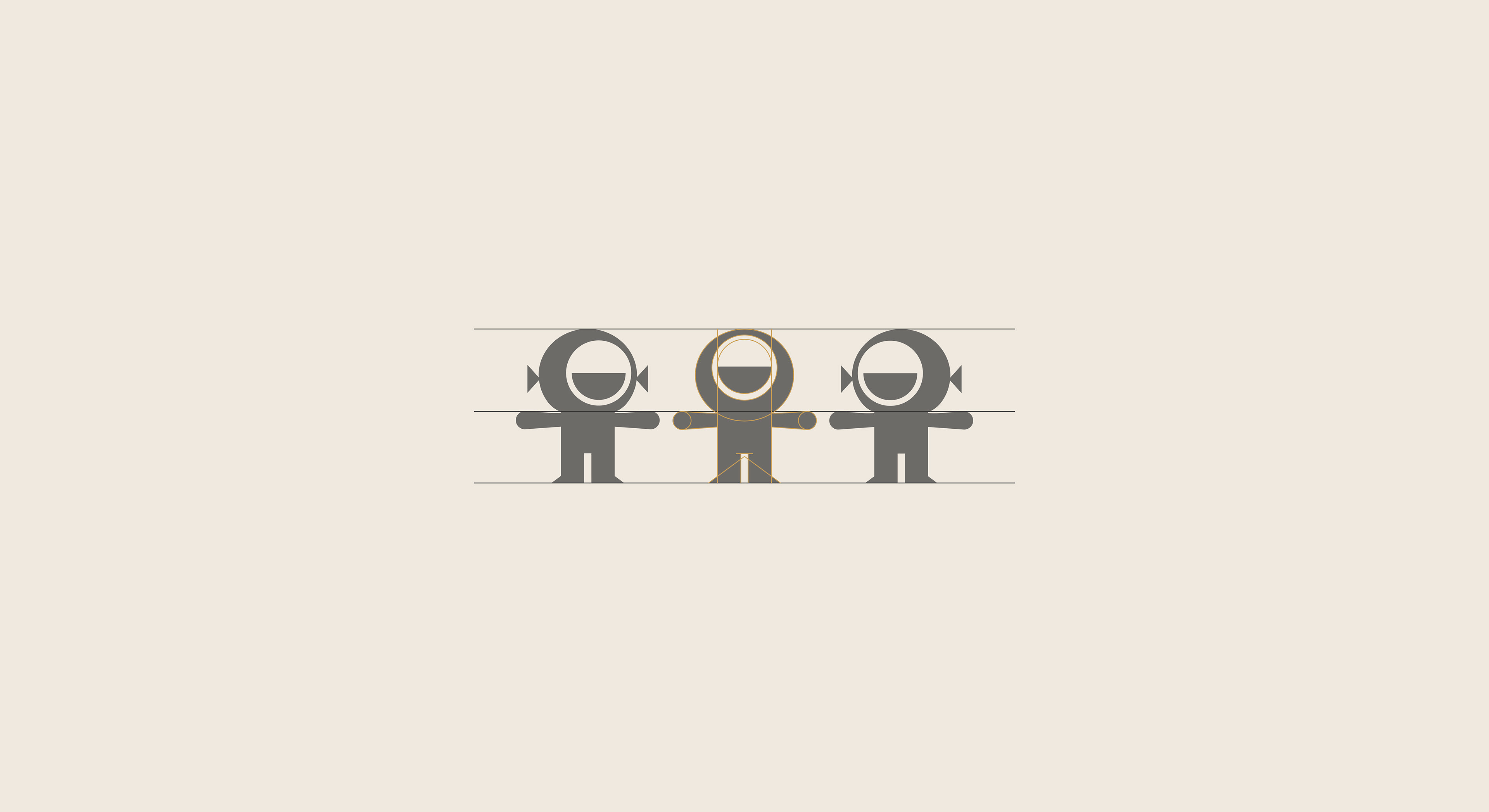
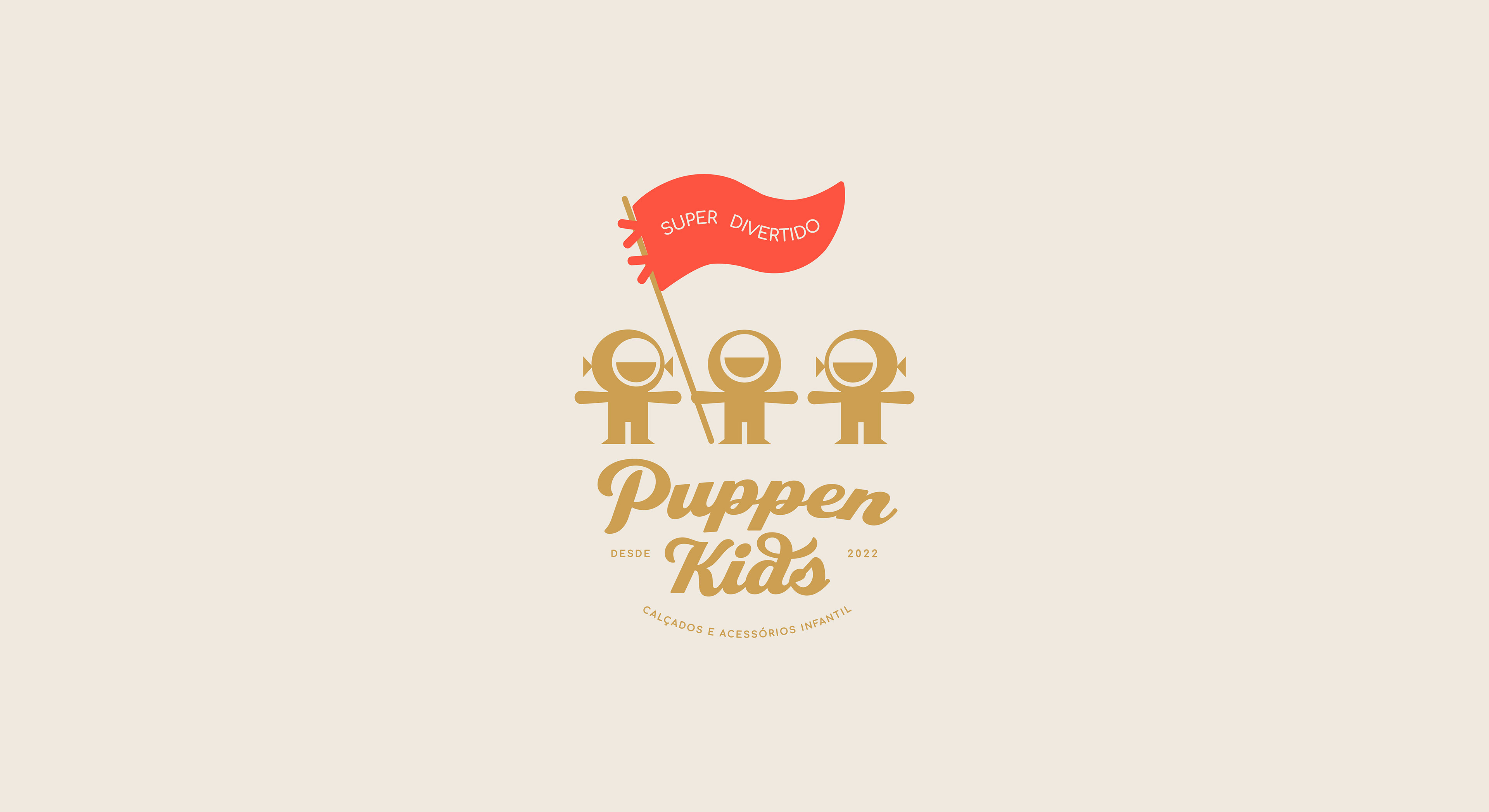
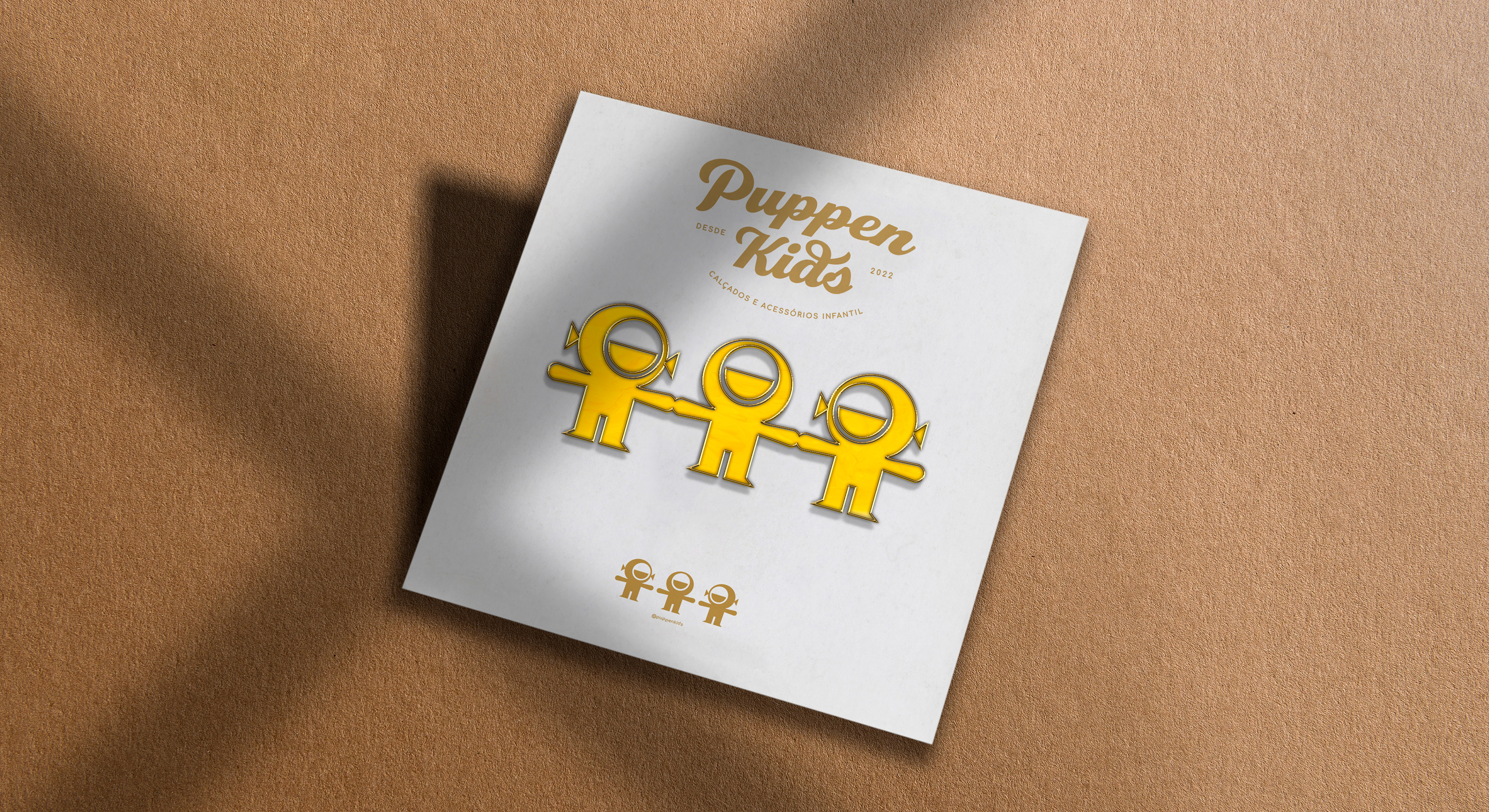
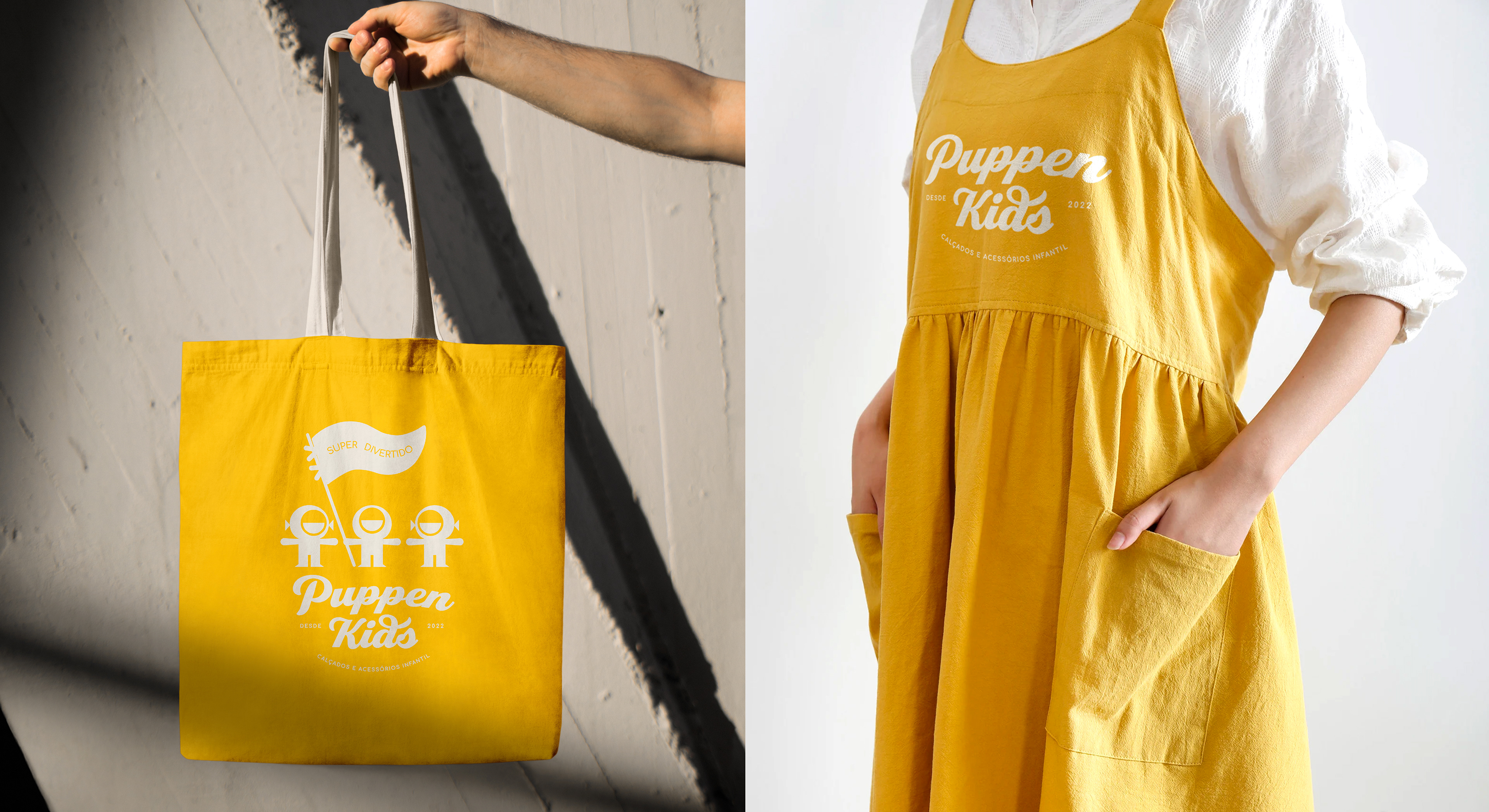
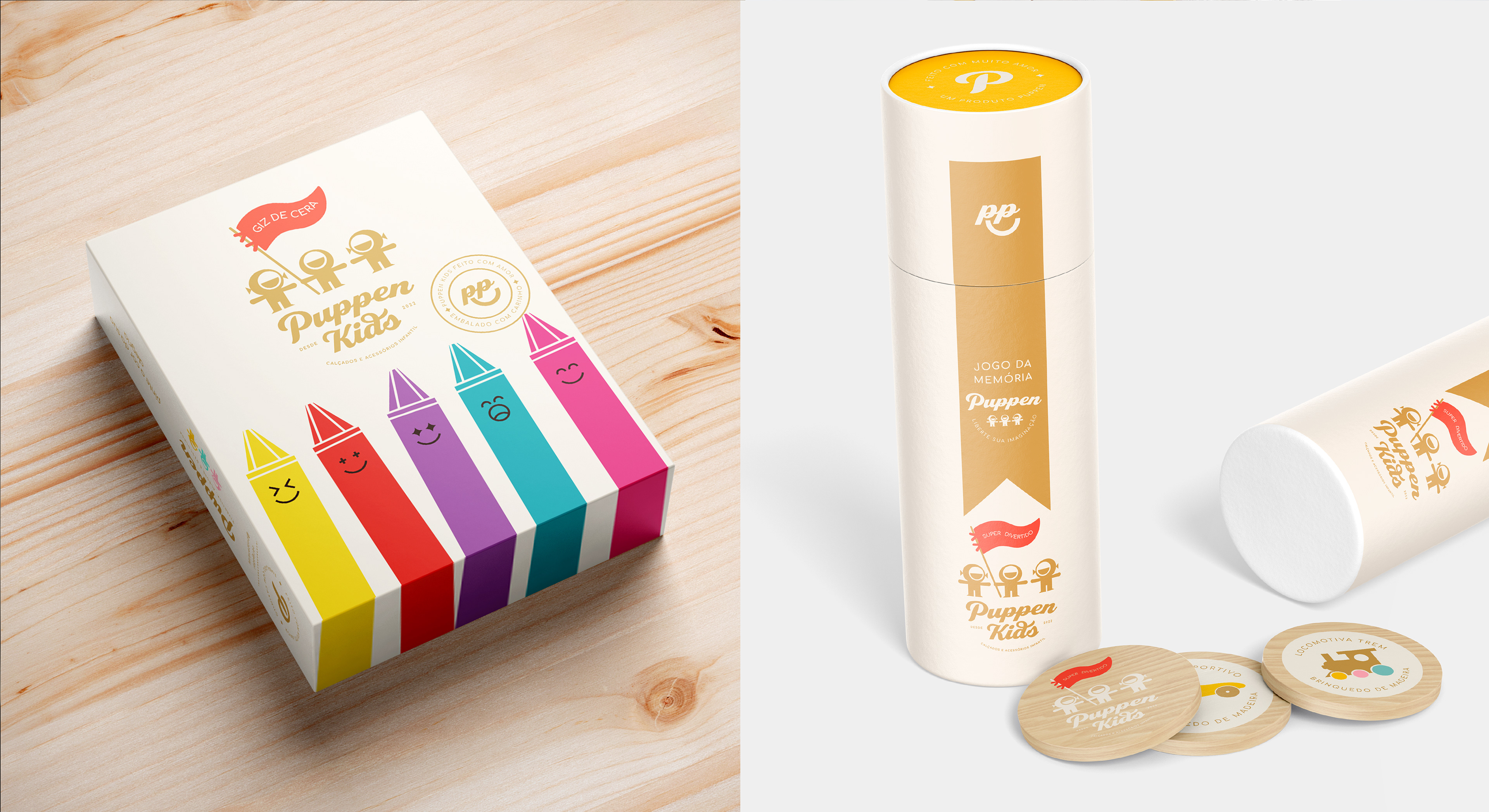
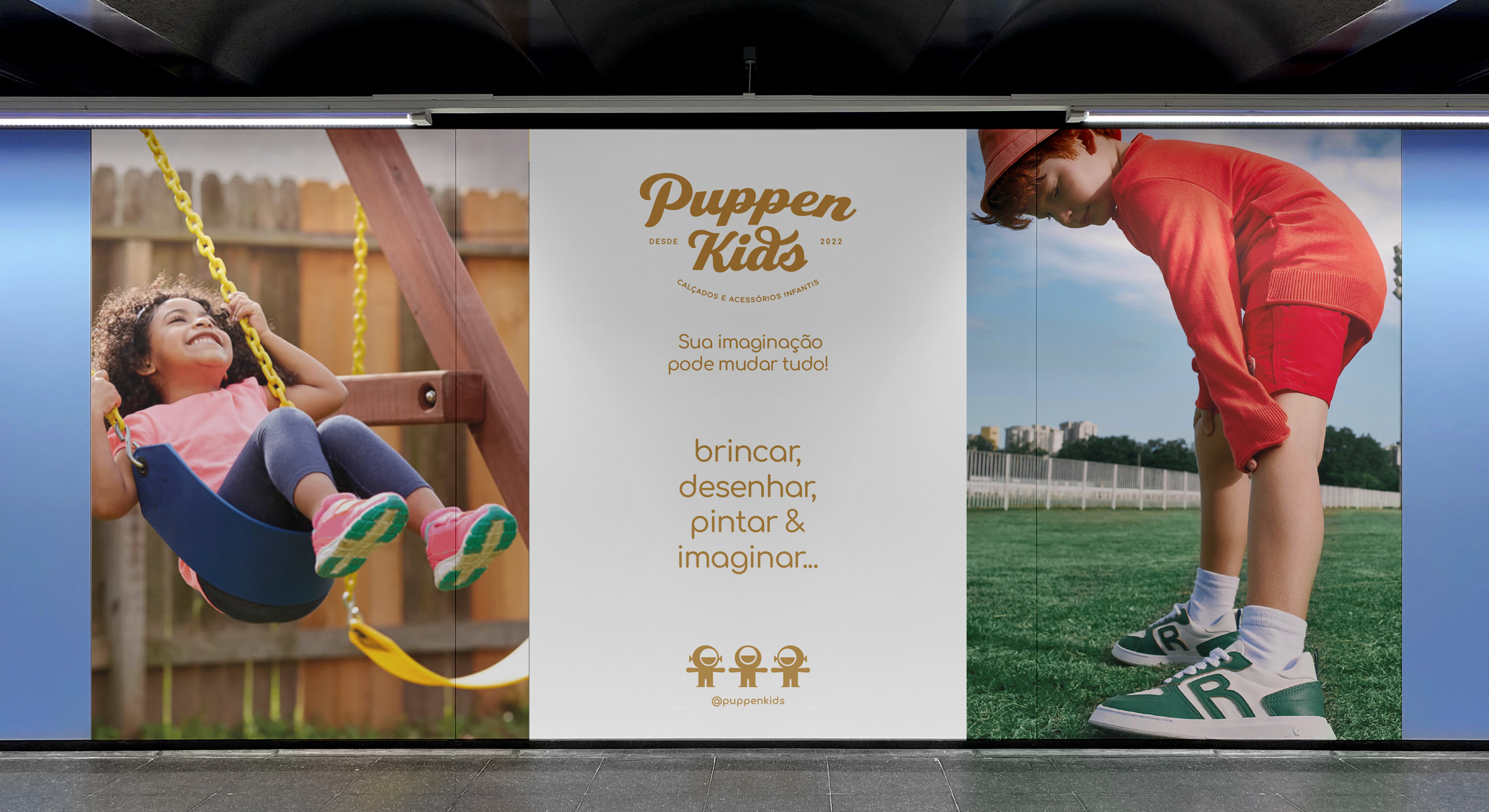
The purpose of this visual identity is to encourage children to create their own imaginary world, to express themselves and play with comfort and style. The three dolls were strategically designed to initially represent Hannah, João Guilherme and Isadora, children of Puppen Kids entrepreneurs - the biggest incentive to open a store in this segment. ⠀⠀
⠀⠀
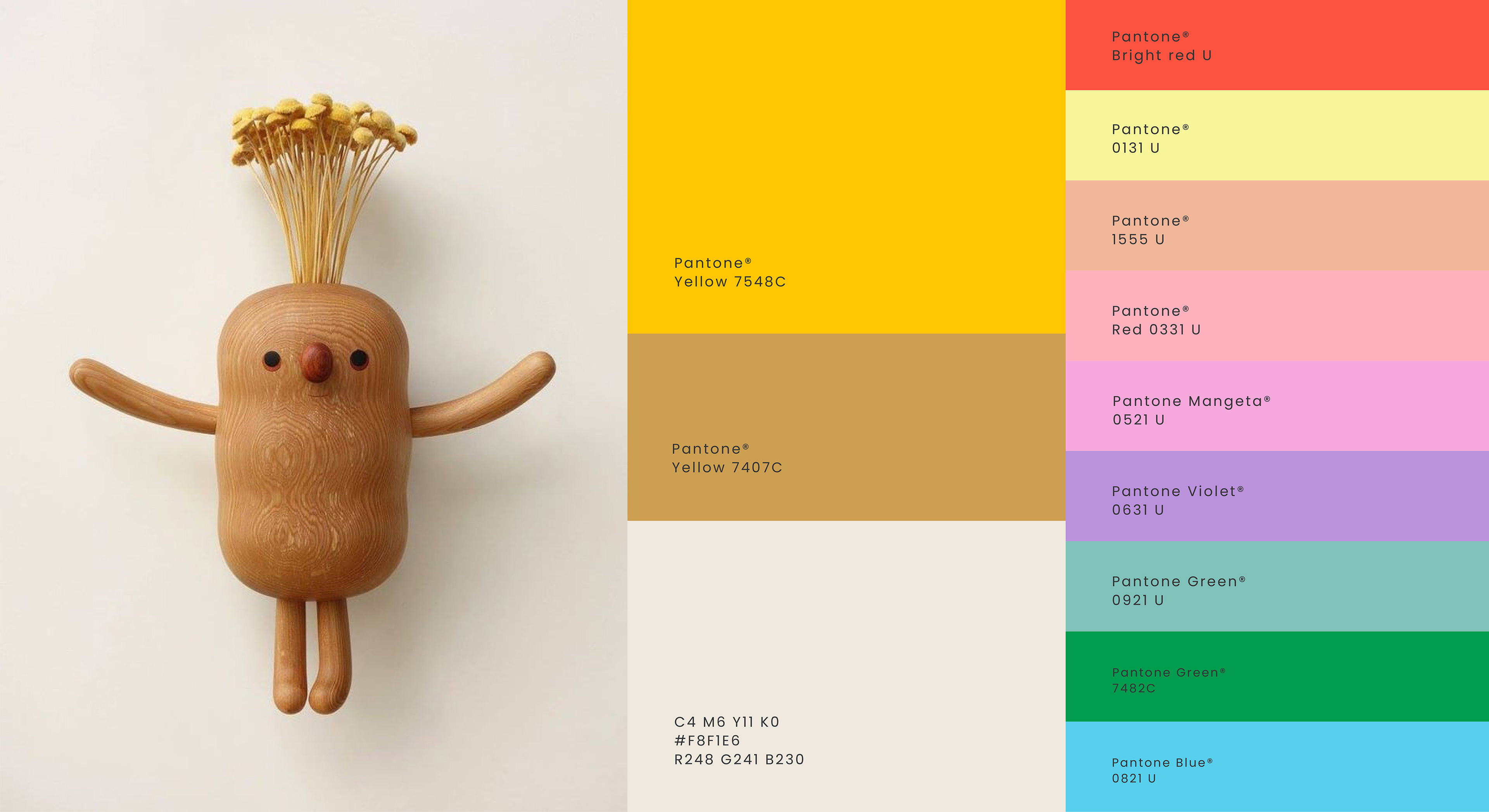
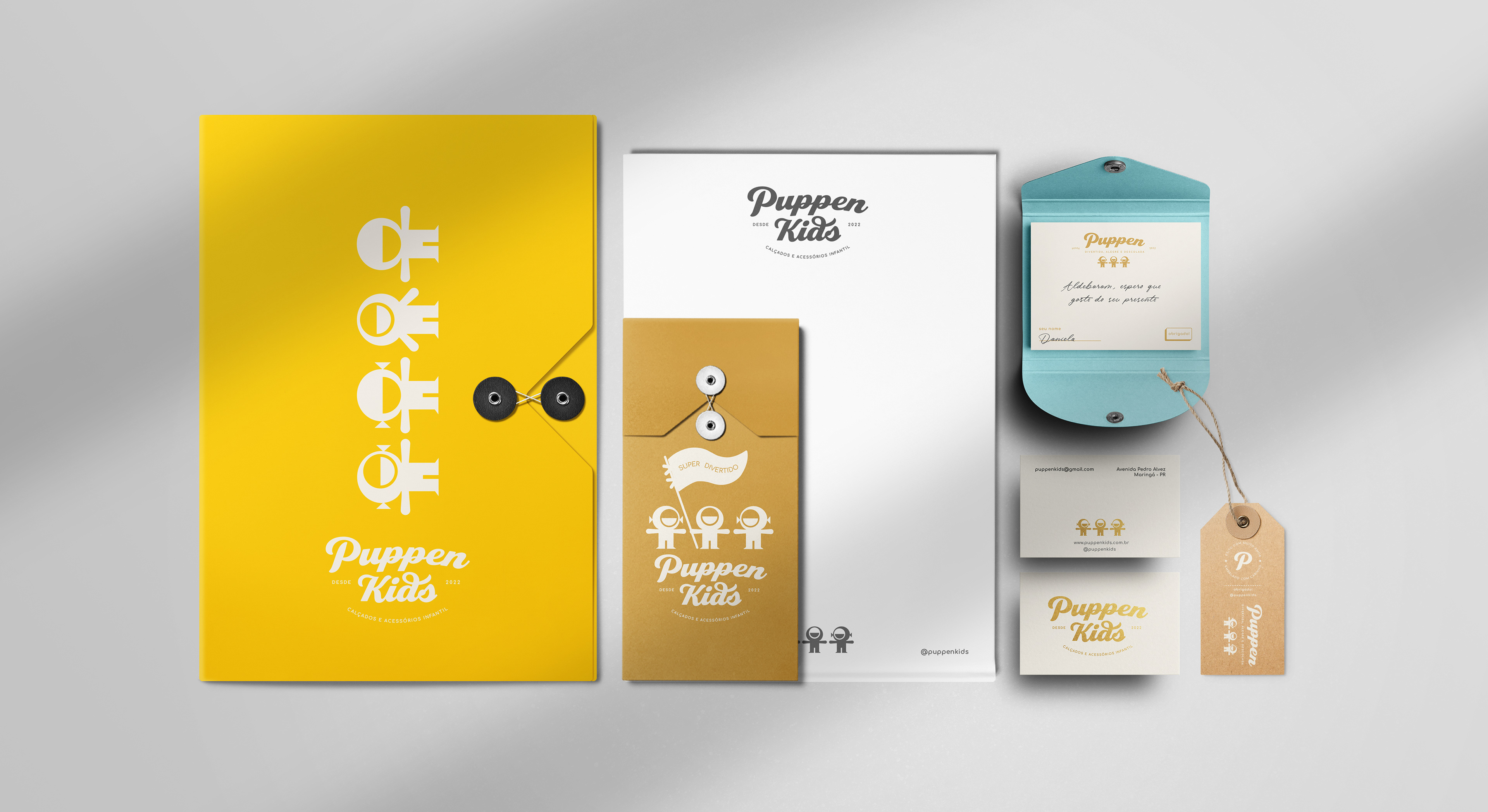
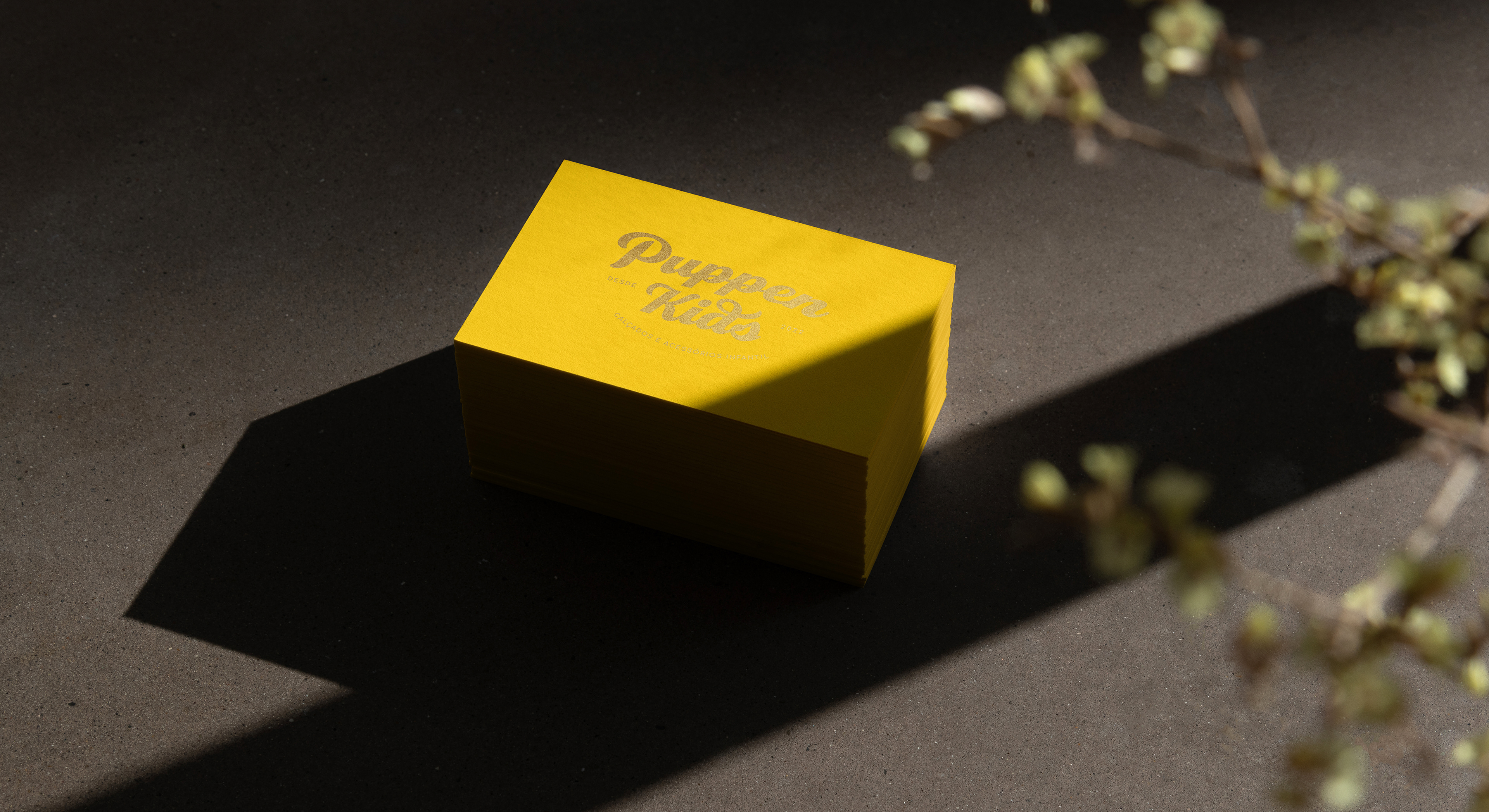
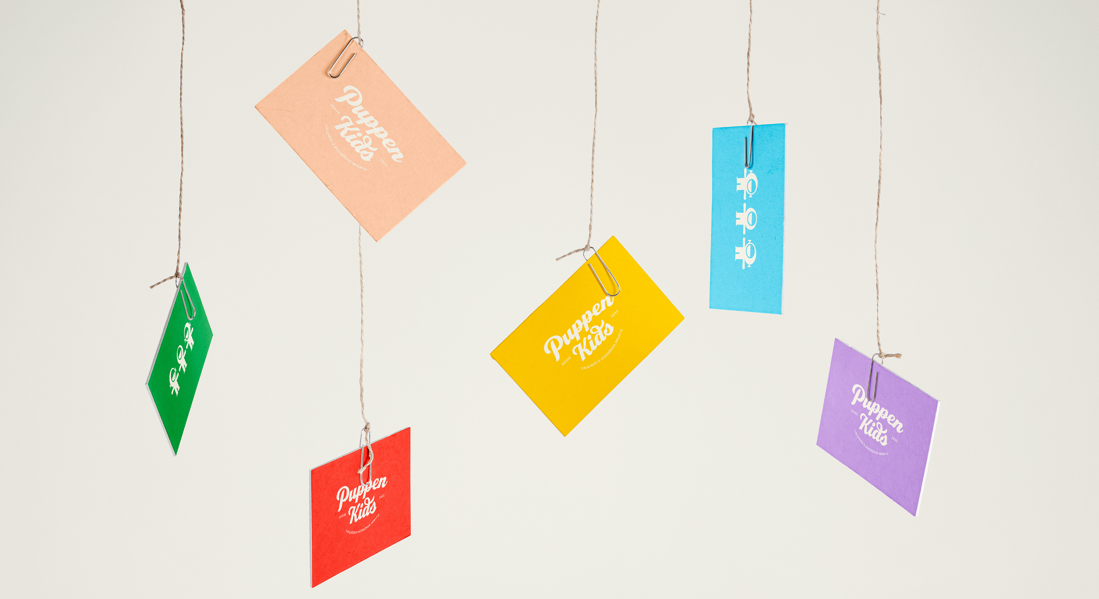
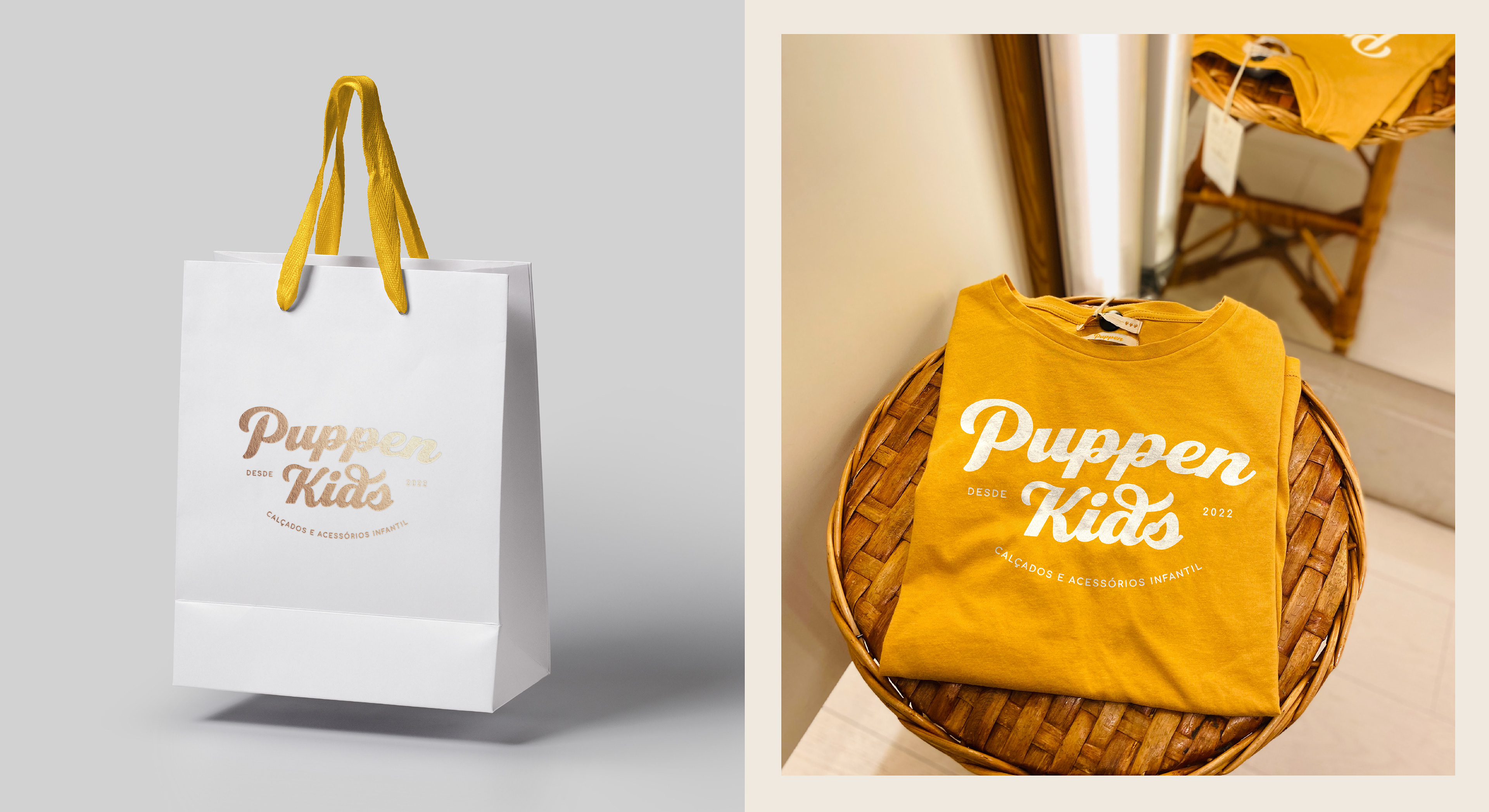
Being a democratic color, yellow is prevalent in Puppen Kids' visual identity - not imposing any gender barriers. ⠀⠀
⠀
The dolls historically occupy a place that brings warmth and affection, in addition to the rescue of free play. They were used in the complementary material as well as in the company's name, contextualizing the idea of how dressing can be fun, cheerful and cool. ⠀⠀
⠀
The purpose of this visual identity is to encourage children to create their own imaginary world, to express themselves and play with comfort and style. The three dolls were strategically designed to initially represent Hannah, João Guilherme and Isadora, children of Puppen Kids entrepreneurs - the biggest incentive to open a store in this segment. ⠀⠀
⠀⠀
Being a democratic color, yellow is prevalent in Puppen Kids' visual identity - not imposing any gender barriers. ⠀⠀